What a Freelance Portfolio Website Needs to Win Clients
What a freelance portfolio website needs to win clients: sharp positioning, three to five projects, one credible case study, proof, and one clear next step.
Updated:
A freelance portfolio website needs five things: clear positioning, three to five selected projects, one complete case study, attributed proof, and one obvious way to make contact. Everything else is optional.
Most portfolios do not fail because the work is bad. They fail because everything is included and everything receives the same emphasis. When a visitor has to decide what matters, the portfolio has stopped doing its job.
Try the One-Screen Test before changing the design. Open your homepage, capture the first viewport, and show it to someone outside your field. Ask two questions: What does this person do? Who is it for? If the answer takes more than a sentence—or the viewer starts guessing—the problem is positioning, not polish.

This guide is for freelance designers, photographers, creative developers, and small studios that already have work to show. It focuses on what belongs on the website, what should be removed, and how to turn finished projects into evidence a potential client can trust.
Later in the article, six Framer templates demonstrate different portfolio structures. Four are from Swiss Themes and two are by our friends at Favorit × Frame. That relationship is stated up front because recommendations are more useful when their context is visible.
1. Decide What the Website Is For
A gallery displays work. A portfolio helps someone decide whether to contact you. Those are different jobs.
Choose the action before choosing the layout. For most freelancers it is one of three: send an inquiry, book a call, or reply to direct outreach. Once the action is clear, every page has a standard to meet — a project or a navigation item earns its place when it makes that action more likely.
This does not mean building an aggressive sales funnel. A portfolio can be quiet, personal, and editorial and still have a direction. Six equally prominent contact options and a homepage of undifferentiated projects make the visitor do work the site should have done.
Write positioning that can survive the One-Screen Test
A useful positioning sentence follows a simple structure: what you make + who it is for + a differentiator that is actually true.
Weak: “Creative designer making meaningful experiences.” Stronger: “Brand identities for early-stage climate companies.”
Weak: “Freelance photographer based in London.” Stronger: “Food and hospitality photography for independent restaurants.”
Weak: “I design digital products.” Stronger: “Product design for complex B2B tools that need to feel simple.”
Specificity feels risky because it appears to turn work away. In practice, it makes you legible. A founder may still hire the hospitality photographer for a portrait; the positioning simply tells the intended client, quickly, that they have reached the right person.
If your work spans several disciplines, lead with the one you want to sell next. The portfolio is not a complete historical record. It is an argument about the work you should be hired to do now.
Give the homepage a deliberate reading order
The homepage does not summarize the site; it establishes fit and creates momentum. A practical order is:
Positioning and the primary contact action in the first viewport.
One strong project or a small selected-work grid as the first evidence.
A short explanation of how you work or what clients hire you for.
Specific proof placed beside the next contact opportunity.
The order is not mandatory, but it exposes unnecessary sections. A long biography before the work delays proof. An Instagram feed above the projects lets unselected posts compete with the work you chose deliberately.
2. Curate the Work Before Designing the Grid
Use three to five projects as a working constraint, not an immutable rule. The number forces a useful question: if only five projects could represent you, which five would make the strongest and most coherent case?
Apply one test to every candidate: Do I want more work like this? If the answer is no, remove it from the featured set regardless of the client’s name, the fee, or the effort it required. Featured work trains potential clients what to ask you for.

The set should not show every skill. It should show enough range to make the positioning believable. A brand designer might choose an identity system, a packaging project, a digital launch, and one case study that reveals strategic thinking. Four projects can feel more substantial than twenty when each one has a distinct role.
If you do not have enough client work
Three projects presented deeply are stronger than eight presented thinly. A self-initiated project counts when it is labelled honestly and built around a credible brief. State what you chose to explore, the constraints you imposed, and what the exercise demonstrates. Do not invent a client or imply commercial results that did not happen.
If the best work is protected by an NDA
You can often show judgment without exposing protected details. Remove the client name, replace sensitive screens, and describe the problem at a higher level. Clarify your role, the type of constraint, the decisions you made, and what changed. Ask the client what can be shown instead of assuming the answer is nothing.
If the prestigious project no longer represents you
Keep the name as supporting proof if it still carries useful credibility, but demote it. Do not place an old project first merely because the client is famous. The first screen establishes your current standard; everything after it supplies depth.
Curation is complete when every featured project has a reason to exist. “I spent a lot of time on it” is not a reason. “It shows the sector I want, the process I sell, or the level of craft I want associated with my name” is.
3. Build One Case Study That Feels Like Real Work
A portfolio full of final images demonstrates taste. A case study demonstrates judgment. Clients need both, but judgment is usually harder to infer.
Start with one complete case study rather than writing shallow explanations for every project. Use this structure:
Section | Suggested length | What it proves |
|---|---|---|
Context | 40–60 words | Client, scope, your role, and timeframe |
Constraint | 60–100 words | Why the project was genuinely difficult |
Approach | 150–250 words | The decisions you made and alternatives you rejected |
Outcome | 60–100 words | What changed, measured when possible |
Proof | One quotation | A named client confirms a specific result |
Context: make your responsibility unambiguous
Begin with the facts a client needs to interpret the work: who the project was for, what was commissioned, when it happened, and what you personally owned. “We redesigned the product” is ambiguous when five agencies and an internal team were involved. “I led product design for onboarding and the account area over twelve weeks” is useful.
Constraint: show what made the work difficult
The constraint is what separates a real case study from a tidy retrospective. It might be a six-week deadline, a legacy system that could not be replaced, a small production budget, conflicting stakeholder priorities, limited photography, or an audience with accessibility needs.

Name the constraint without dramatizing it. Then connect it to a decision. For example: “The identity had to work on packaging printed in one color, so we built recognition through proportion and type rather than a large palette.” That sentence reveals more judgment than several paragraphs describing a moodboard.
Approach: explain decisions, not a generic process
Avoid the familiar list—research, ideation, design, delivery—unless each stage contains a decision worth understanding. Explain what you learned, what you rejected, and why the chosen direction survived. One rejected route can be especially valuable because it proves you compared alternatives rather than decorating the first idea.
Write for an intelligent client, not another designer. Replace tool names with consequences. “We created components in Figma” says little. “We reduced eleven inconsistent patterns to four reusable components, so the internal team could add screens without redesigning the interface” explains the value.
Outcome: use evidence you can defend
Use measured outcomes when they exist and when your work plausibly contributed to them. State the source and timeframe if a number could be questioned. Avoid implying that a visual redesign alone caused a company-wide business result.
When there are no metrics, describe observable change. The team can now update the website without a developer. Sales calls no longer begin with the same clarification. The client launched on time. The new system supports three product lines instead of one. Specific, modest evidence is more persuasive than an unsupported “34% increase.”
Proof: ask for a quotation while the project is fresh
A useful testimonial confirms something the case study has already shown. Ask at project close, when the decisions and outcomes are still clear. Make the request easy by offering a short draft the client can edit; never publish words they have not approved.
Before publishing the case study, check for three common failures: images without context, no clear statement of your role, and old work presented as your current standard. A beautiful page cannot compensate for uncertainty about what you actually contributed.
4. Put Proof Beside One Easy Contact Action
Proof is most useful at the moment someone is deciding whether to act. Do not quarantine every testimonial on a separate page that few visitors will open. Place a relevant quotation after the project outcome or beside the final inquiry prompt.
“Great to work with” is pleasant but weak. A stronger testimonial includes a full name, role, company, and a specific observation: “Mara turned an inconsistent set of product screens into a system our internal team can extend without design support.” The second version reduces uncertainty about both the result and the working relationship.
A practical hierarchy of proof is: named client outcome, named client praise, relevant client logo, award, then follower count. The order may change by field, but proximity and specificity usually matter more than volume. One strong quotation beside a relevant case study can do more than a wall of twenty logos.
Make the next step unmistakable
Choose one primary contact action and repeat it consistently. “Start a project,” “Book a call,” and “Email me” should not compete with equal weight on the same screen. Secondary channels can remain available in the footer or contact page.
A simple inquiry form needs a name, email address, and message. Add budget, timing, or service fields only when the answer changes what you do next. Every question should earn its place by saving meaningful follow-up work or filtering projects you cannot accept.
Set a response expectation—such as “I reply within one working day”—and include your timezone if you work internationally. Then test the form monthly from an email address you do not control. A broken confirmation or spam rule can quietly remove the only path from interest to inquiry.
5. Design the Frame to Support the Work
The website is both a container and a sample of your judgment. Its job is not to be visually neutral; its job is to establish a hierarchy in which the projects remain primary.
If the work is colorful, layered, or motion-heavy, begin with a restrained background and a limited type system. Contrast helps each project register as a distinct object. If the interface is as expressive as every project, the visitor sees one continuous field of noise.
Consistency carries more credibility than novelty. Repeated spacing, predictable navigation, stable image ratios, and a small set of type sizes signal attention to detail across the whole system. Those qualities also make the portfolio easier to maintain when new work arrives.
Test the design on a phone over mobile data. Can the visitor understand the positioning, open the first project, and reach contact without waiting for decorative media? Performance and mobile behavior are design decisions because they determine whether the work can be seen at all.
For the underlying design principles, read Swiss Design Principles for Web Designers and Why Minimalism Works. For more visual references, compare the Swiss-style website examples in the companion gallery.
6. Six Portfolio Structures, Shown in Practice
Choose a template by the structure your work needs, not by the animation in its preview. The right starting point removes irrelevant decisions and leaves room for your identity.
Swiss Folio: projects and writing in one system
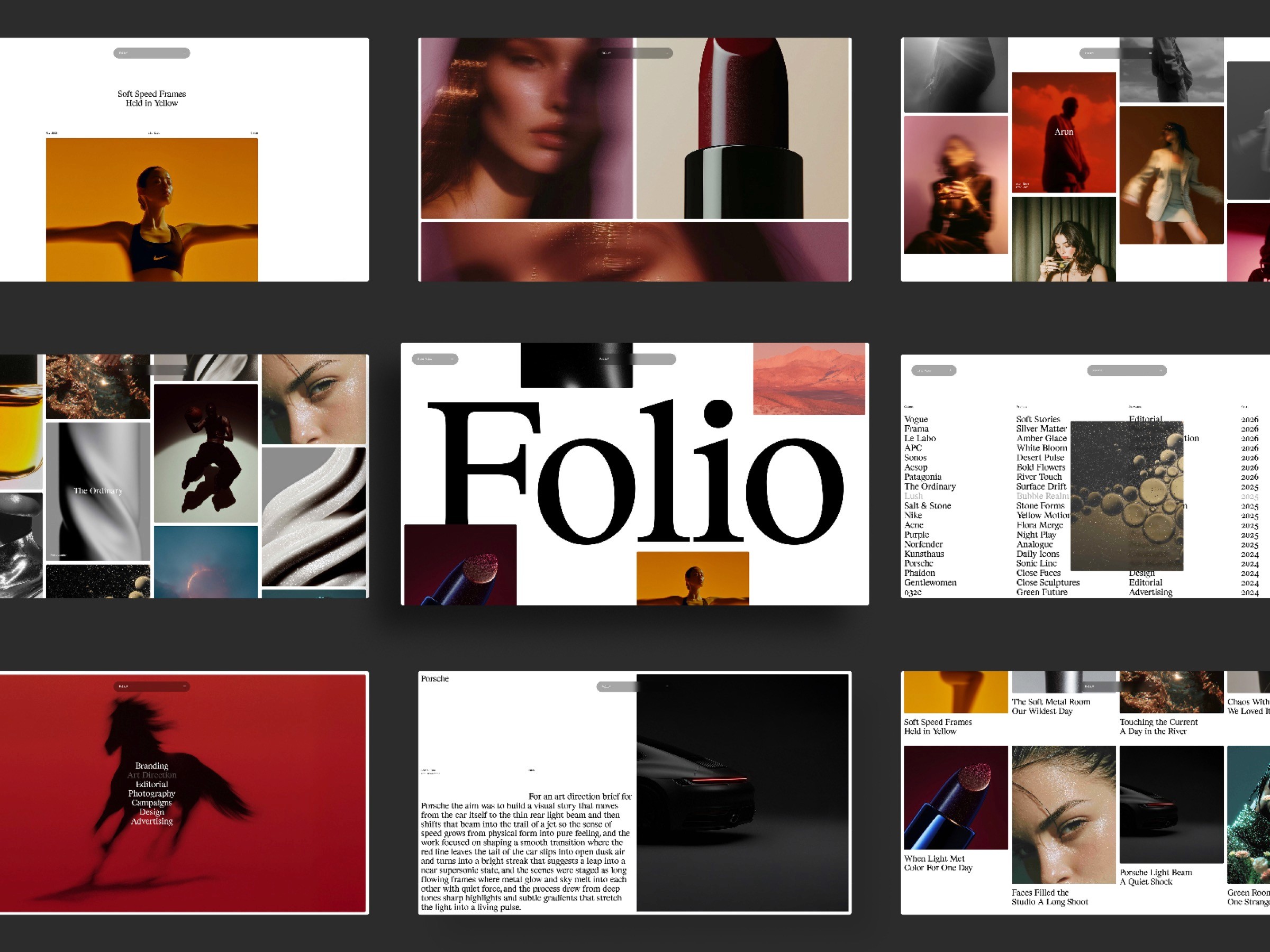
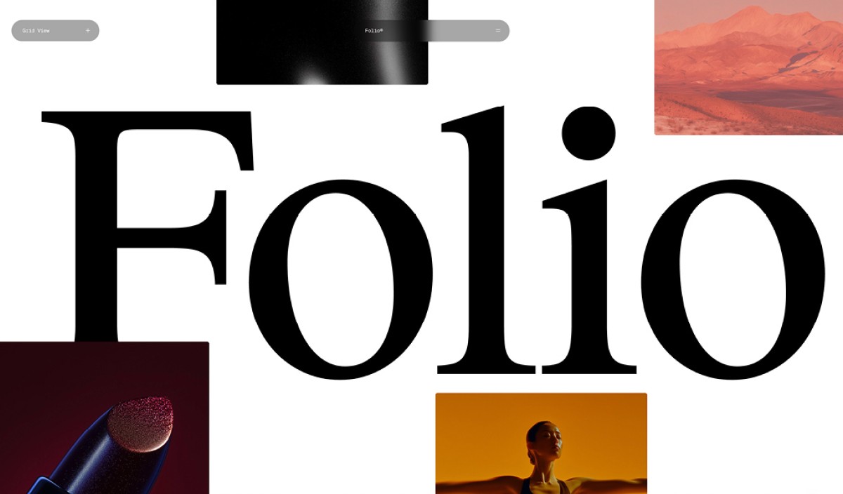
Swiss Folio suits a freelancer or studio whose ideas are part of the offering. The project grid and list support visual browsing, while the journal creates a separate reading mode for process notes and essays. Skip the journal if you are unlikely to maintain it.
Preview Swiss Folio · Get the template
Swiss Minimal: image and motion carry the experience
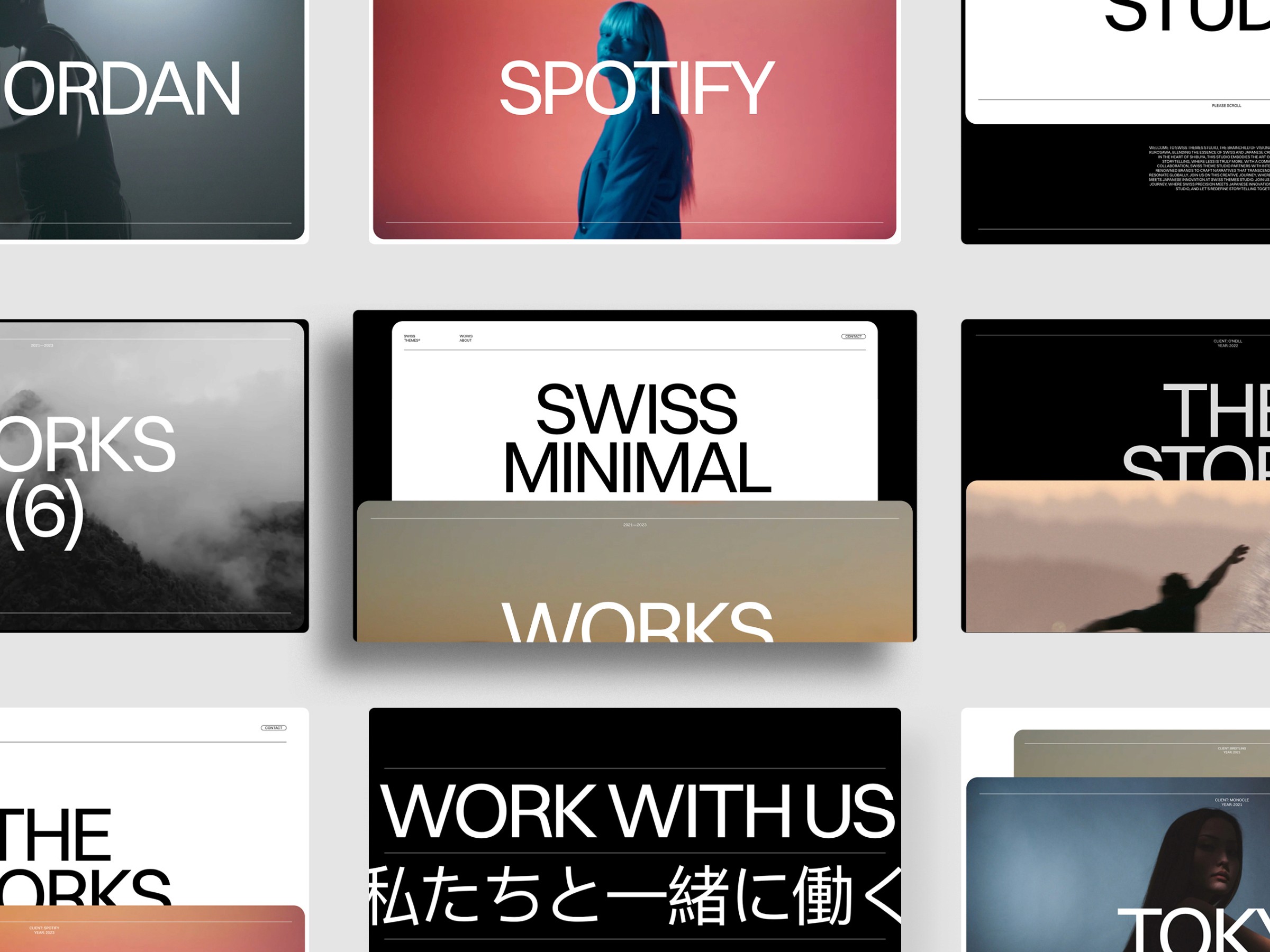
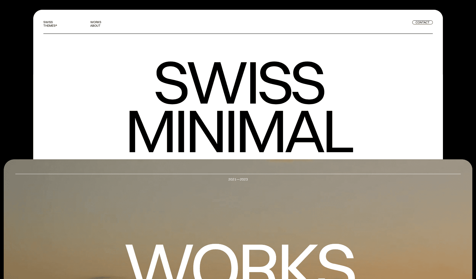
Swiss Minimal gives large images and video more spatial presence while keeping navigation and typography quiet. It works when the media already explains the value—photography, art direction, motion, image-led campaigns. It is less suitable when every project needs strategic explanation before the visuals make sense.
Preview Swiss Minimal · Get the template
Swiss Reduce: let the interface almost disappear
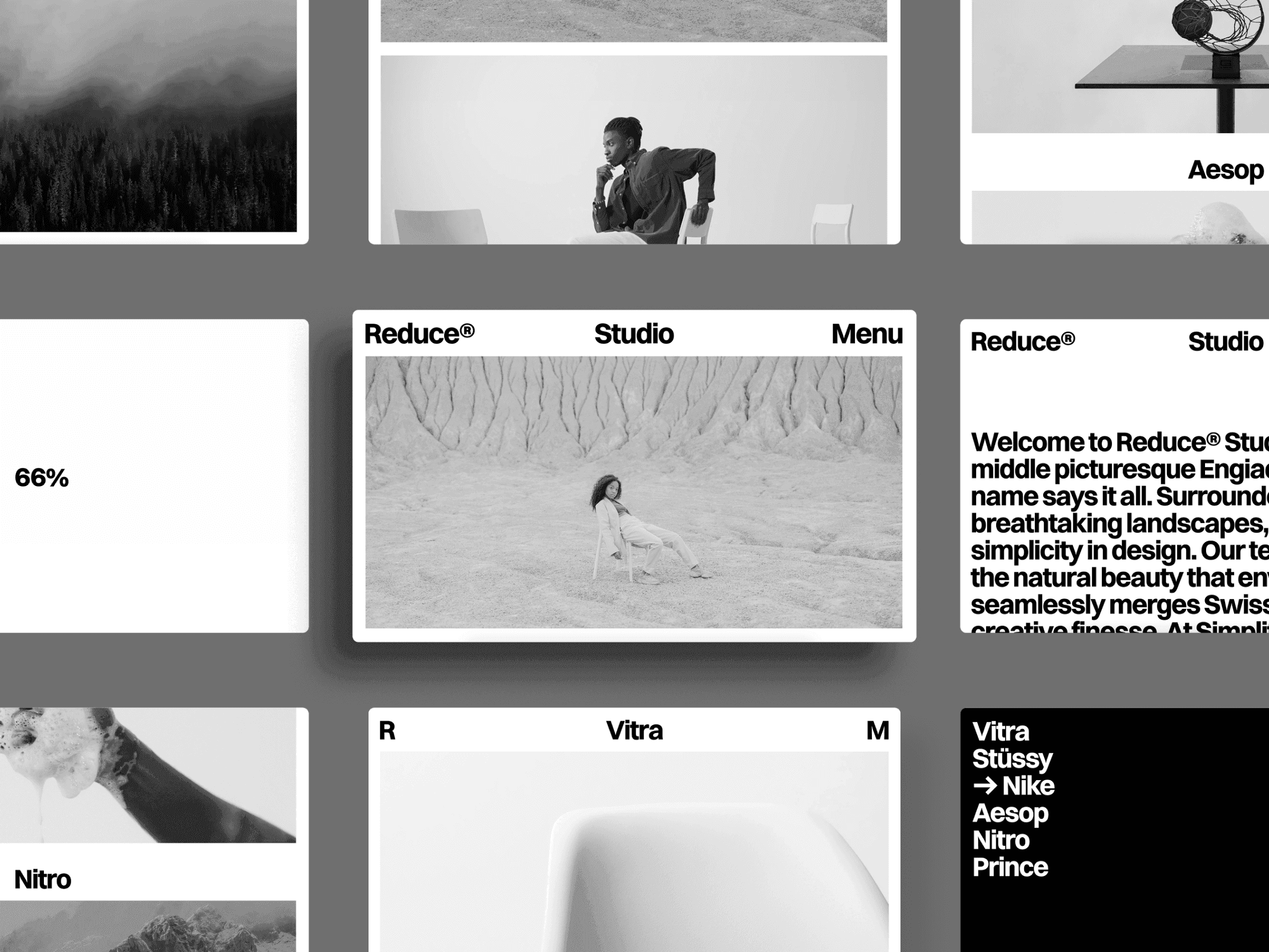
Swiss Reduce is the clearest option when restraint is the point. Its small visual vocabulary keeps attention on project imagery, titles, and transitions. Use it when the work varies in color or style and needs a consistent frame. The reduced interface also makes weak curation obvious.
Preview Swiss Reduce · Get the template
Swiss Mono: validate the positioning first
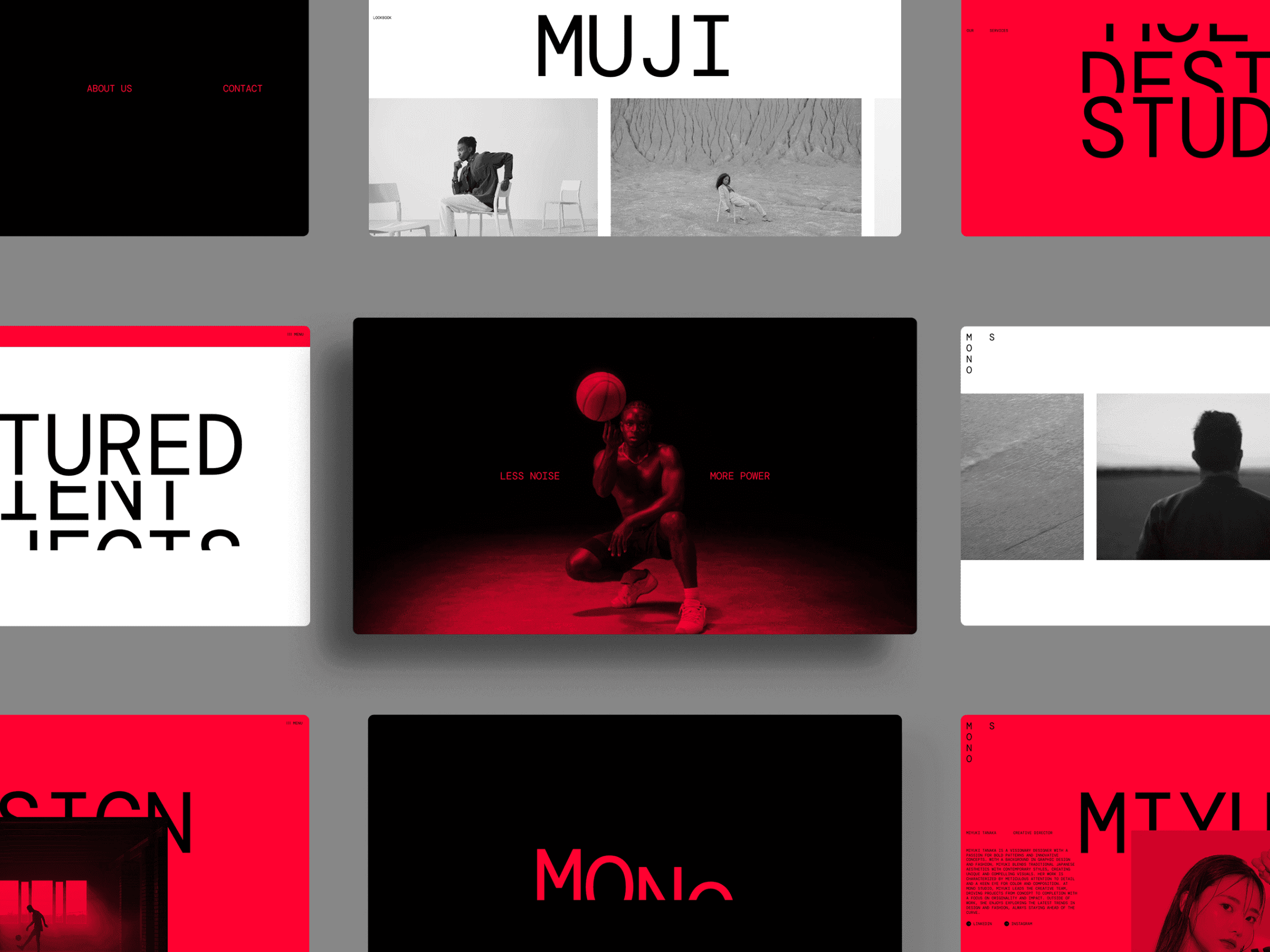
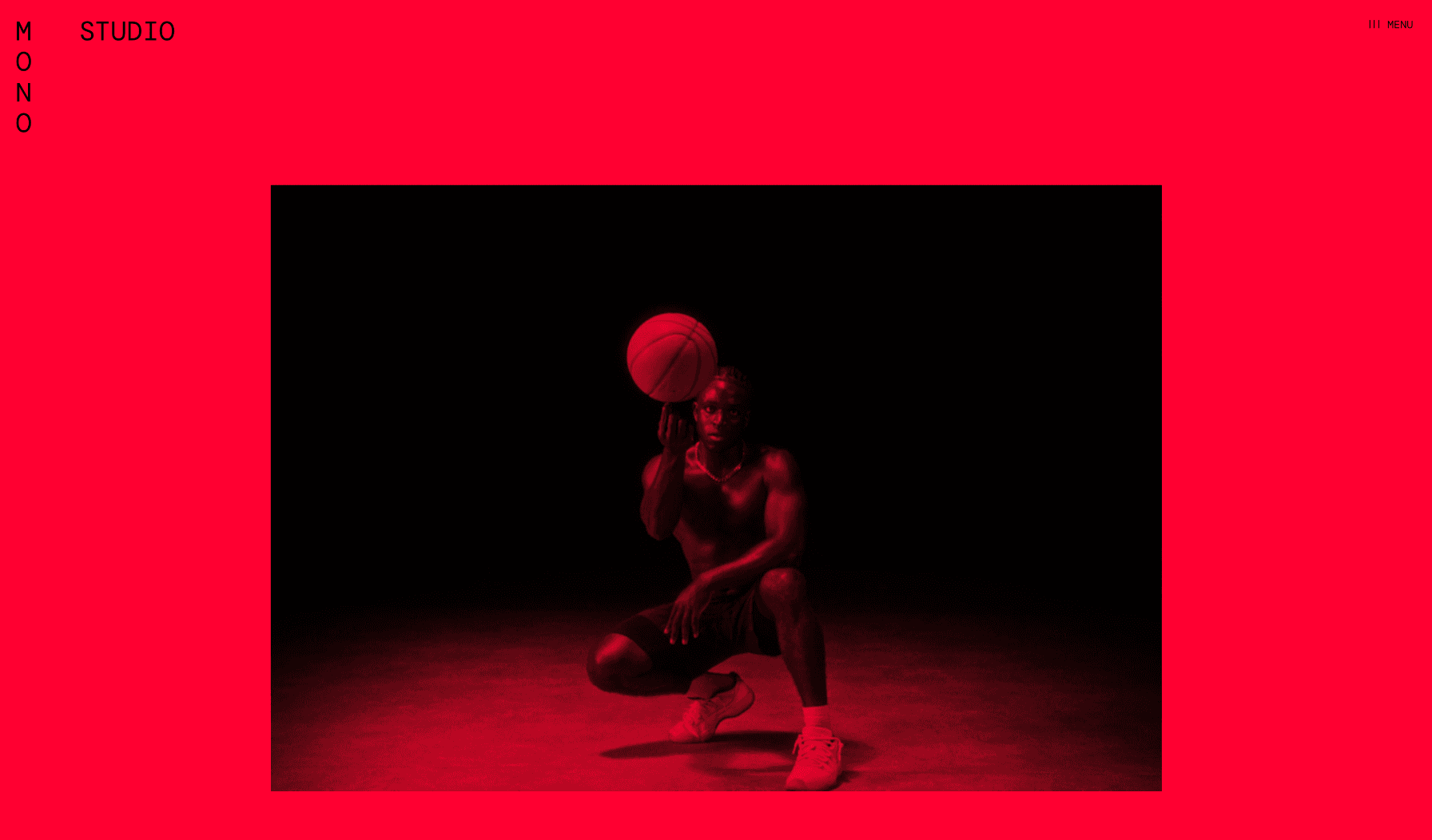
Swiss Mono is a free one-page option for someone who needs a credible site before committing to a larger system. A compact page forces the essentials: positioning, selected work, services, contact. Launch it, observe what clients ask about, and expand when real content requires it.
Preview Swiss Mono · Get the free template
FF Identity: make the identity system the case study

FF Identity is aimed at brand and identity designers whose deliverable is a system rather than a single screen. Its structure lets one project expand through typography, color, applications, and art direction. Choose it when the relationship between assets is the work.
Preview FF Identity by Favorit × Frame
FF Widgets: a compact, personal portfolio
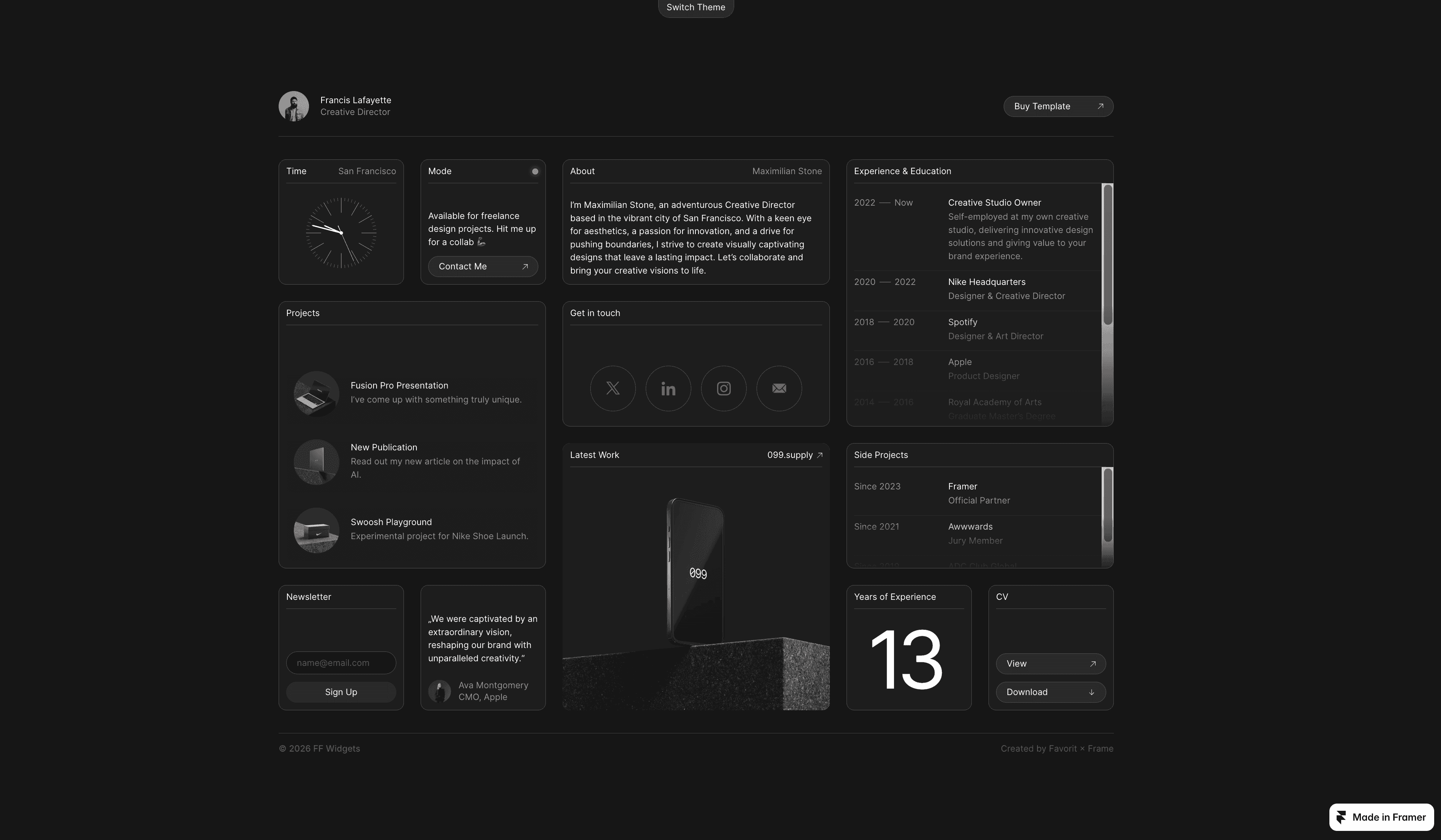
FF Widgets uses modular blocks for projects, experience, side projects, links, and contact. The format feels more personal than a formal studio site and can show several facets of one person without a long biography. It is strongest when each widget has a distinct purpose and the inquiry path stays visible.
Preview FF Widgets · Get the template
7. Launch Checklist
Before publishing, check the decisions rather than polishing details indefinitely:
The first viewport explains what you do and for whom.
Three to five featured projects all represent work you want more of.
At least one case study names the constraint and your personal role.
A specific, attributed testimonial appears near the relevant project or inquiry action.
Contact is reachable from every page in one click.
The form works when tested from an address you do not control.
The first project is usable on a phone over mobile data.
Typography, spacing, and navigation remain consistent across the homepage and project pages.
Every page has a deliberate title and description.
Recent work or an updated date makes the portfolio feel maintained.
Maintain by replacing, not accumulating
Review the portfolio quarterly. Add a project only when it earns its place, and decide what it replaces. Re-read the positioning, test the form, check broken links, and see which projects visitors are curious enough to open.
A portfolio is a living selection, not an archive. Its quality depends as much on what you remove as what you publish.
Conclusion
The freelance portfolio website that wins clients is not necessarily the largest or most elaborate. It is the one that has made the important decisions before the visitor arrives: what the freelancer does, which work matters, why the decisions were credible, and how to start a conversation.
Start with what you have, choose deliberately, and improve from real conversations. A good portfolio today is more useful than a perfect portfolio someday.
Explore the full Swiss Themes template collection if you want a restrained starting point for the structure you have chosen.