8 Swiss-Style Website Examples (and What Makes Them Work)
Explore eight Swiss-style website examples from Swiss Themes and Favorit × Frame, with practical lessons on grids, typography, white space, and motion.
Updated:
Swiss-style website examples often share an immediate visual language: a clear grid, assertive sans-serif typography, generous white space, and a restrained palette. But the best examples go further. They use those elements as a system for making content easier to understand.
The eight websites below show different ways to translate Swiss graphic design to the web. Some are quiet and editorial; others introduce motion, unusual transitions, or bolder color. What connects them is not a single look, but a commitment to hierarchy, reduction, and purposeful structure.
All eight are Framer templates, which makes them more useful than a gallery of static inspiration. You can study how the principles hold together across project pages, CMS content, and responsive layouts—not only in one carefully composed screenshot.
The first four examples are our own Swiss Themes templates. The final four are by our friends at Favorit × Frame. We are making that relationship clear because recommendations are more useful when their context is visible.
What Makes a Website Feel Swiss?
Swiss web design is not simply black type on a white background. Its character comes from a small set of connected decisions:
A grid that organizes relationships. Text, images, navigation, and white space share a visible logic.
Typography that carries the hierarchy. Scale, weight, and spacing do more work than decorative elements.
Reduction with a purpose. Fewer elements make the important ones easier to notice.
Asymmetry within order. The composition can feel dynamic without becoming arbitrary.
A limited visual vocabulary. One distinctive color or interaction is often enough.
These principles can produce very different results. That range is the reason this list includes portfolio, agency, and startup templates rather than twelve near-identical monochrome sites.
The Eight Examples at a Glance
Template | Best for | Defining move |
|---|---|---|
Agencies and design studios | Makes the underlying grid part of the experience | |
Image- and motion-led portfolios | Places expressive movement inside a restrained frame | |
Freelancers, artists, and photographers | Combines portfolio and editorial structures | |
Agencies and compact studio sites | Uses brutalist energy within a disciplined one-page system | |
Type-led creative portfolios | Uses large typography and monochrome contrast with confidence | |
Agencies and motion designers | Lets interaction support the work rather than compete with it | |
Architecture and interior design studios | Gives image-led spatial work a quiet, typographic frame | |
Design-led stores and product brands | Applies a precise grid to product discovery and commerce |
1. Swiss Style: The Grid Becomes Visible
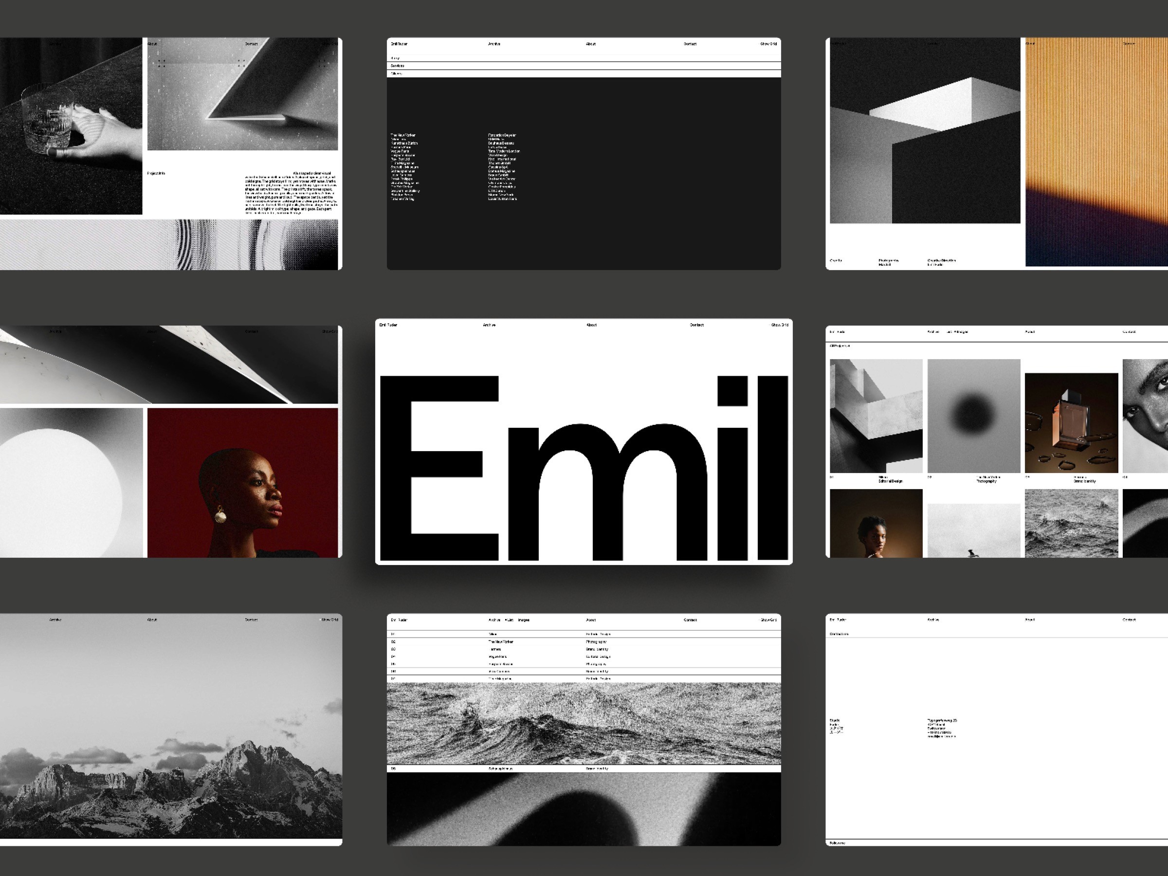
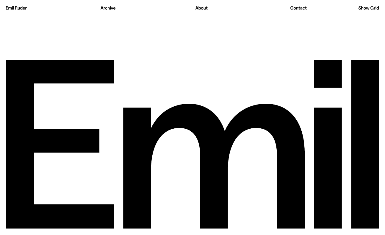
Swiss Style is the most direct interpretation of the International Typographic Style in this selection. Created in honor of Emil Ruder, it treats the grid as more than a hidden construction tool. A custom “Show Grid” interaction lets visitors see the structure behind the page.
That decision works because it is relevant to the design rather than added for novelty. The project views, typography, and transitions already follow the same system. Revealing the grid simply makes the underlying logic legible.
The lesson is not that every Swiss-style website needs an exposed grid. It is that a distinctive interaction feels convincing when it expresses the central idea of the design.
Best for: agencies, studios, and independent designers who want a recognizably Swiss identity without turning their portfolio into a historical imitation.
2. Swiss Minimal: Restraint Does Not Mean Stillness
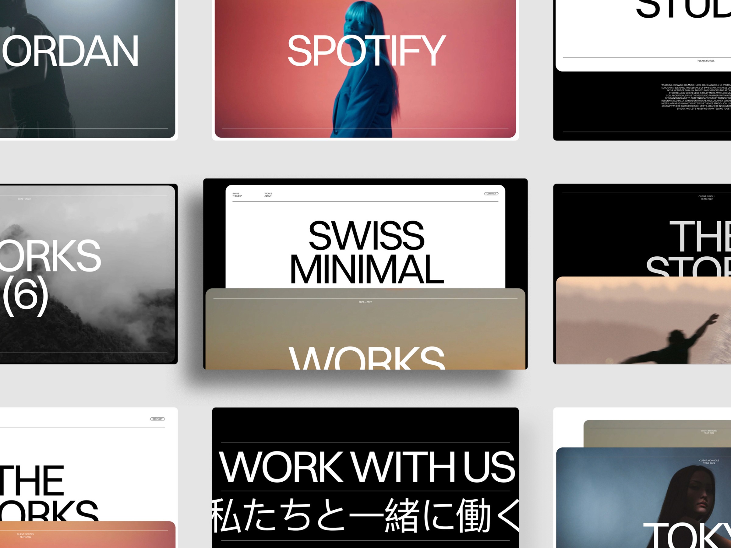
Swiss Minimal shows how motion can coexist with reduction. Its scrolling tile treatment gives images and video a spatial, almost three-dimensional presence, while the surrounding interface stays deliberately quiet.
This balance matters. Motion-heavy portfolios often make every transition compete for attention. Here, the movement is concentrated in the presentation of the work. Typography, navigation, and color remain restrained, so the projects retain visual priority.
Swiss design is sometimes reduced to static print conventions. Swiss Minimal makes a more useful translation: keep the information architecture disciplined, then use the possibilities of the medium where they add meaning.
Best for: creative studios, artists, and designers whose work benefits from motion or rich imagery but still needs a calm, professional frame.
3. Swiss Folio: An Editorial Portfolio System
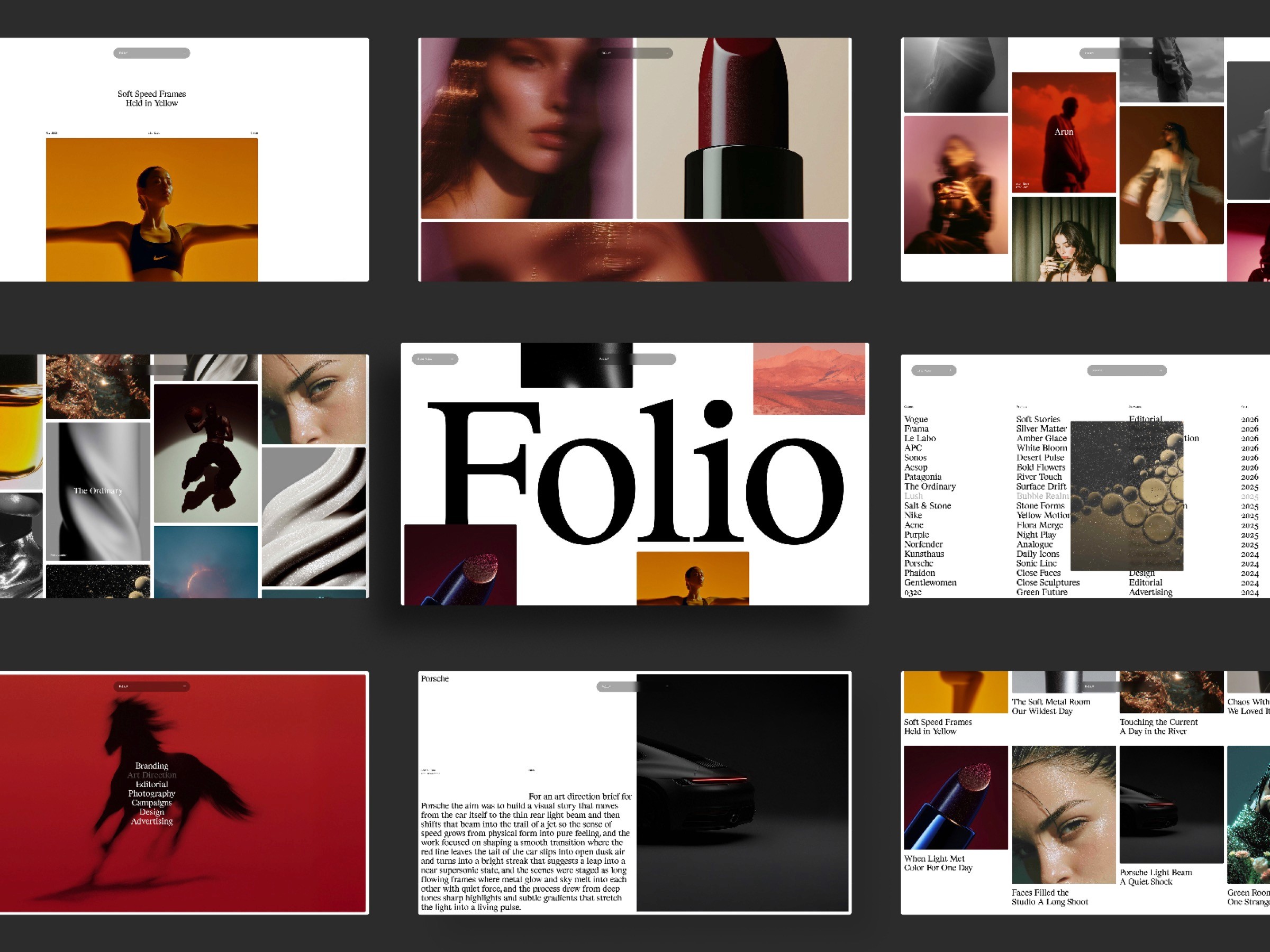
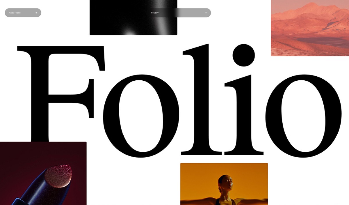
Swiss Folio sits between a portfolio and a publication. Projects can be viewed in grid or list form, while the journal creates space for longer ideas, process notes, or studio news.
The design feels Swiss because the different content types still belong to one typographic system. A list view and an image grid serve different reading modes, but alignment and spacing keep them coherent. The result is flexible without feeling modular for its own sake.
This is a useful reminder that reduction should not remove valuable content. A minimal site can support projects, writing, and varied browsing patterns—as long as the hierarchy remains clear.
Best for: freelancers, photographers, artists, and small studios that want their thinking to sit alongside their visual work.
4. Swiss Brut: Reduction with More Edge
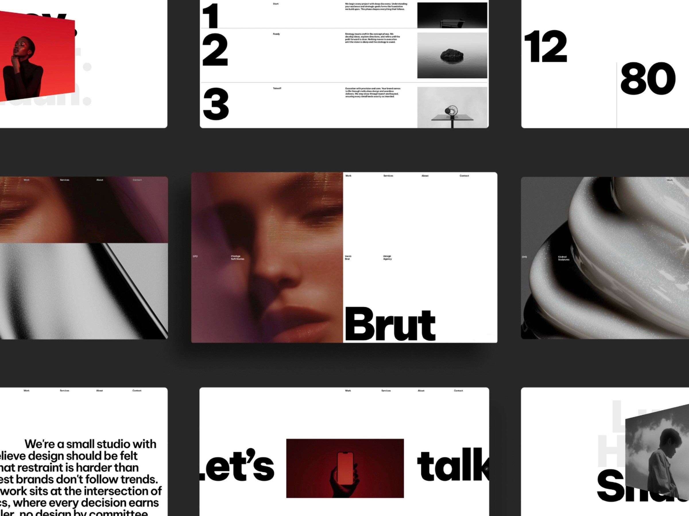
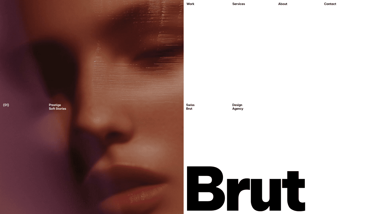
Swiss Brut compresses the essentials of an agency or studio site into a single page. Oversized typography, tightly framed project imagery, and a blunt black-and-white palette give the template more edge than the quieter examples in this list.
The brutalist influence is controlled by a visible grid and deliberate spacing. Raw typographic scale creates impact, while clearly separated sections keep the services, projects, and team content easy to follow.
Its lesson is that a one-page website does not need to feel simplistic. Reduction can make a compact site more memorable when every section has a clear role and the visual system stays consistent.
Best for: agencies, creative studios, photographers, and independent teams that want a concise portfolio with a stronger graphic presence.
5. FF Minimal: Typography as the Main Image

FF Minimal by Favorit × Frame makes typography carry much of the personality. Large type, a monochrome palette, and controlled spacing create a portfolio that feels direct rather than empty.
The most convincing detail is the relationship between scale and content. Oversized typography establishes identity, while project imagery and CMS pages provide the depth. Light and dark modes extend the system without changing its basic character.
Many minimal portfolios become interchangeable because they remove too much and replace it with nothing. FF Minimal avoids that problem by treating type as an active compositional element.
Best for: graphic designers, creative directors, and studios with strong project imagery and a concise point of view.
6. FF Move: Interaction with a Clear Role
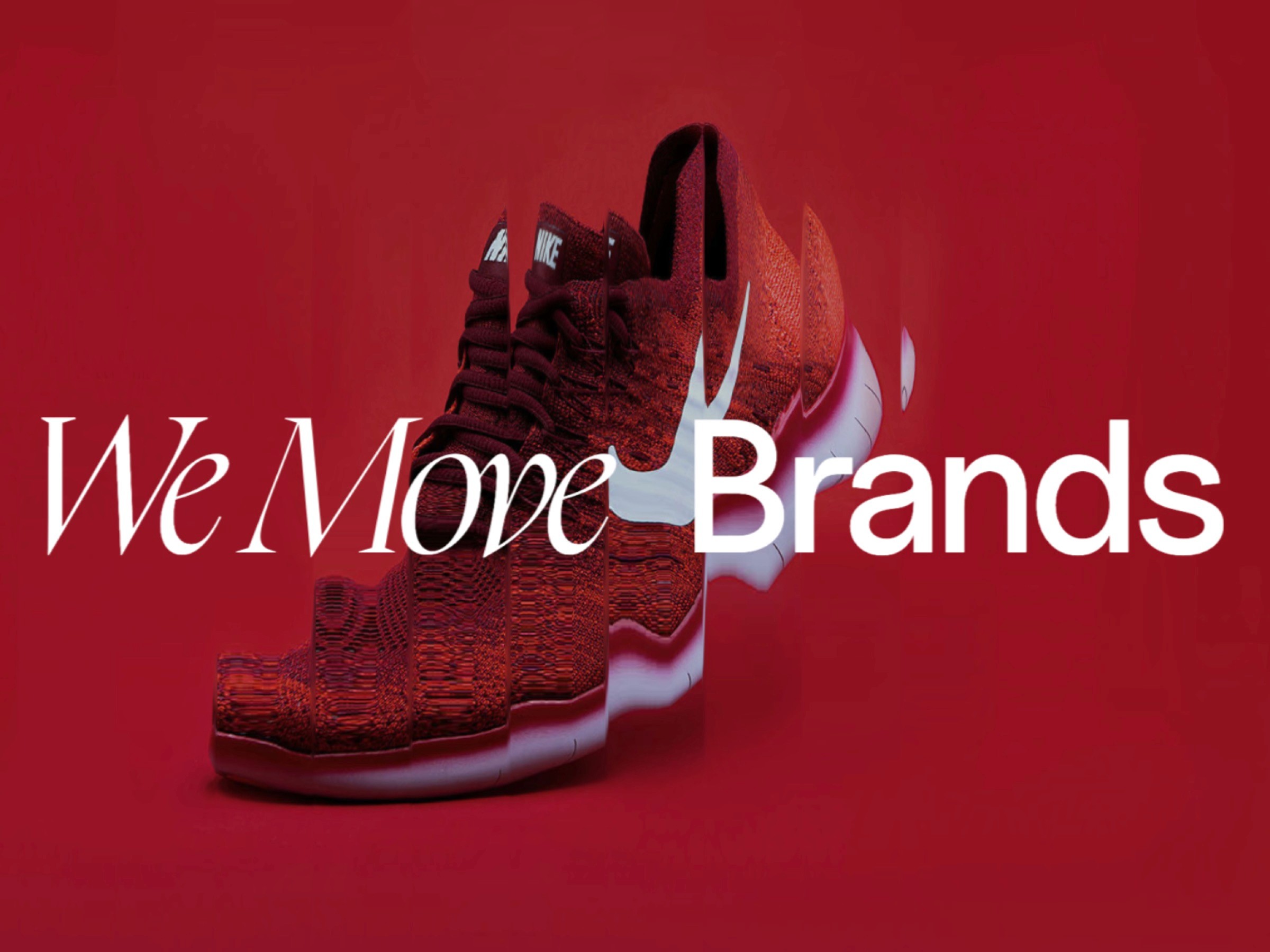
FF Move is designed for agencies and designers working with photography, motion graphics, or other visually rich material. Its interactive distortion treatment adds energy, but the underlying typography and structure remain simple.
What makes the design relevant to this list is the division of labor. The grid organizes. Typography labels and guides. Interaction creates emphasis. None of the three tries to do everything.
That clarity is especially important for animated Swiss-style websites. The question is not whether motion is allowed; it is whether the motion improves attention, sequence, or understanding. FF Move uses it to make project browsing feel more physical without covering the work in interface effects.
Best for: agencies, photographers, and motion designers who want an expressive portfolio while retaining a minimal framework.
7. FF Architect: A Minimal Frame for Spatial Work

FF Architect is designed for architects, designers, and minimalists. Its reduced setup gives project imagery most of the visual space, while restrained navigation and small labels keep the portfolio easy to understand.
The strongest moments come from the contrast between oversized type and quiet, image-led grids. Project pages use the same typographic discipline, so the identity remains present without competing with the architecture.
The lesson is especially useful for work that already contains visual complexity. A minimal system does not flatten detailed content; it gives that content a stable frame and a clear reading sequence.
Best for: architecture practices, interior designers, and studios whose portfolio depends on large, carefully presented images.
8. FF Shop: Swiss Clarity Applied to Commerce
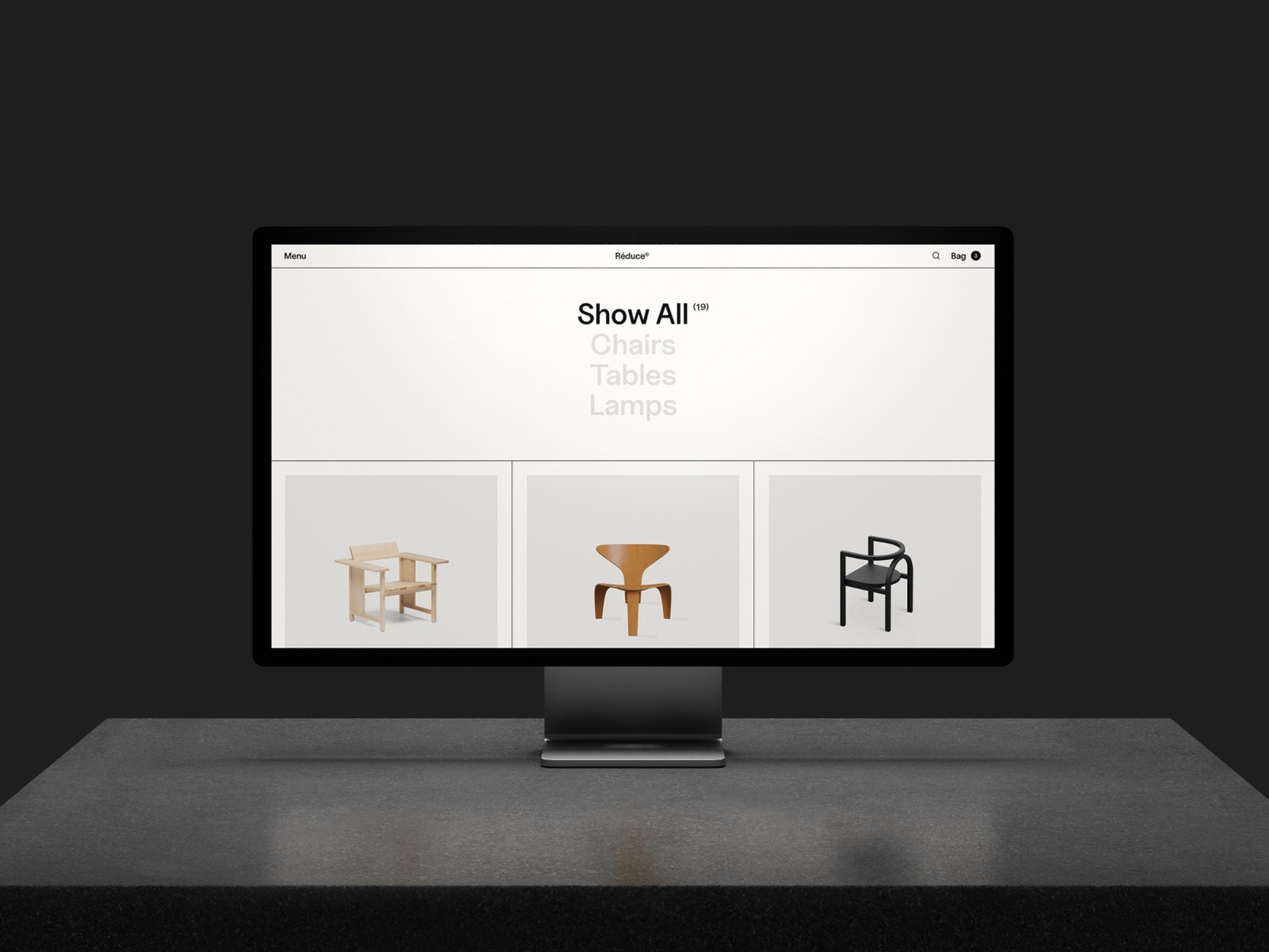
FF Shop applies the same concern for hierarchy and reduction to e-commerce. Product categories, navigation, and imagery sit inside a precise grid, making a potentially complex storefront feel direct.
The design avoids the visual noise common to online shops. Typography guides browsing, product photography remains prominent, and the monochrome interface gives functional elements a consistent place without turning them into decoration.
Its lesson is that Swiss principles are not limited to portfolios. A strong information system can make commerce feel more premium by reducing friction and helping customers understand where to look next.
Best for: furniture, fashion, and design-led product brands that want a restrained storefront with a strong editorial character.
What These Examples Have in Common
The eight websites look different, but they make several of the same decisions.
They Start with Content
Each design has a clear subject: projects, studio capabilities, writing, or a product story. The visual system helps that content become easier to scan. It does not exist as an independent layer of decoration.
They Use One Strong Gesture
An exposed grid, a scrolling tile, a typographic scale, or a distortion effect can give a site its identity. Repeating several equally loud ideas would weaken all of them. The strongest examples choose one gesture and let the rest of the interface support it.
They Treat White Space as Structure
Empty areas separate groups, establish rhythm, and direct attention. This is different from adding large gaps everywhere. Good white space has a relationship to the grid and the importance of the content around it.
They Remain Useful Beyond the Homepage
A Swiss-style hero can be composed quickly. The harder test is whether the system still works on a case study, journal entry, contact page, or small screen. These examples succeed because their hierarchy continues across the full site.
How to Build the Swiss Look in Framer
If you are creating a Swiss-inspired website from scratch, begin with a system rather than a collection of visual references.
1. Establish the Grid First
Choose a consistent content width, column structure, and gutter. Align headings, images, metadata, and navigation to it. A grid becomes useful through repetition, not complexity.
2. Let Typography Create Hierarchy
One well-drawn sans-serif family is enough for most sites. Use a small number of deliberate sizes and weights. Make the steps between title, heading, metadata, and body copy obvious.
3. Reduce the Palette
Start with the background and text colors. Add one accent only when it has a job: highlighting an action, marking a category, or creating a focal point. A limited palette is most effective when the contrast is strong and accessible.
4. Choose One Expressive Interaction
Framer makes it easy to add effects, which makes editing especially important. Pick the interaction that best supports the content. Keep navigation and essential actions familiar.
5. Test the System on Mobile
Do not simply stack the desktop composition. Preserve the hierarchy, spacing rhythm, and reading order at smaller sizes. The columns may disappear; the underlying relationships should not.
For a deeper explanation of the thinking behind these decisions, read Swiss Design Principles for Web Designers and Why Minimalism Works.
Choosing the Right Starting Point
Choose the example closest to your content, not the one with the most visible effects.
For the most explicit Swiss graphic design language, start with Swiss Style.
For an image-led portfolio with controlled motion, choose Swiss Minimal.
For a portfolio that also needs a journal, consider Swiss Folio.
For a compact one-page portfolio with more edge, try Swiss Brut.
For a monochrome, type-led portfolio, look at FF Minimal.
For motion, photography, and agency work, explore FF Move.
For architecture or interiors, choose FF Architect.
For a minimal, design-led storefront, look at FF Shop.
The best template should remove unnecessary design decisions while leaving room for your content and identity. If the template’s strongest effect does not support your work, it is probably the wrong starting point.
Conclusion
The most useful Swiss-style website examples are not the ones that reproduce a recognizable aesthetic most literally. They are the ones that turn grids, typography, white space, and reduction into a coherent digital system.
These eight examples show that the system can be quiet or expressive, restrained or forceful, static or animated. The common standard is clarity: every visual decision has a role, and the work remains easy to understand.
Explore the full Swiss Themes template collection or browse more work by Favorit × Frame to compare the approaches in detail.